Scaling Bulk User Management for Enterprise Operations
UX/UI Designer
Engineering, Stakeholders
Figma, Figma Make
View the Prototype here.
The Challenge
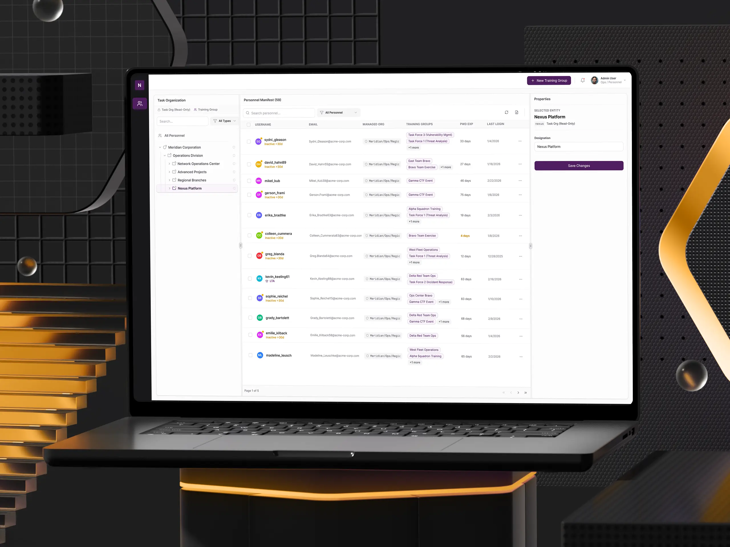
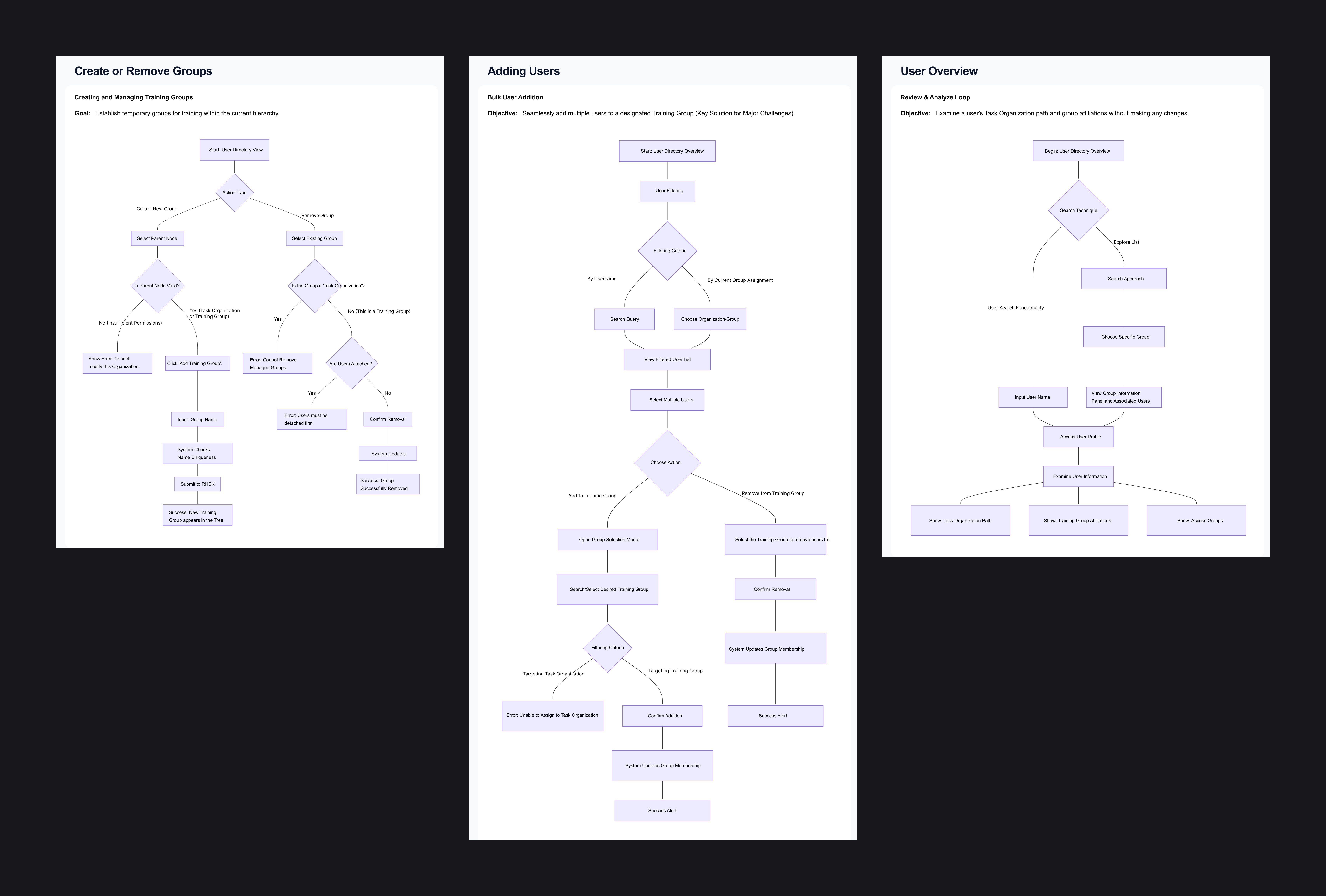
The platform's user management interface needed to handle two fundamentally different types of organizational groups within a single tree hierarchy:
- Managed Organizations: Read-only units synchronized from an external enterprise identity provider. These represent permanent structural groups (e.g., divisions, departments) that cannot be modified through the UI. Changes must flow from the upstream identity system.
- Dynamic Groups: Editable, temporary groups created directly within the UI by authorized users. These support ad hoc team assembly for time-bound exercises or training events.
Both group types coexist in the same hierarchical tree view. The critical UX challenge was making the distinction of what is editable vs. what is locked immediately visible and intuitive.
The existing system required manual, one-by-one user assignments and provided no visual or functional distinction between these two entity types. The result: hours to set up a single training event and monthly support tickets from confused users.
Discovery
Understanding the users
Through stakeholder meetings and event storming sessions with the engineering team, I gained insight into the project's core challenges. Three critical themes emerged:
Mental model mismatch drives errors: Users didn't understand the distinction between permanent organizational structures (managed externally) and temporary dynamic groups (managed locally). This single confusion generated the majority of support tickets.
Information overload creates decision paralysis: Users assigned to 20+ groups saw cluttered, unscannable list views. They needed summary-first interfaces with the ability to drill down on demand.
Screen real estate is premium currency: Dense data tables competed with navigation for viewport space. Every pixel mattered - especially when displaying organizational paths and multiple group assignments.
Framing the Problem
When I joined the project, it was clear that the core issue wasn't just about efficiency - it was about cognitive clarity. Users weren't just frustrated by repetitive clicks. They couldn't tell what they were allowed to do.
Training Managers think top-down: "Show me a group, then show me who's in it."
Admins think bottom-up: "Show me a user, then show me where they belong."
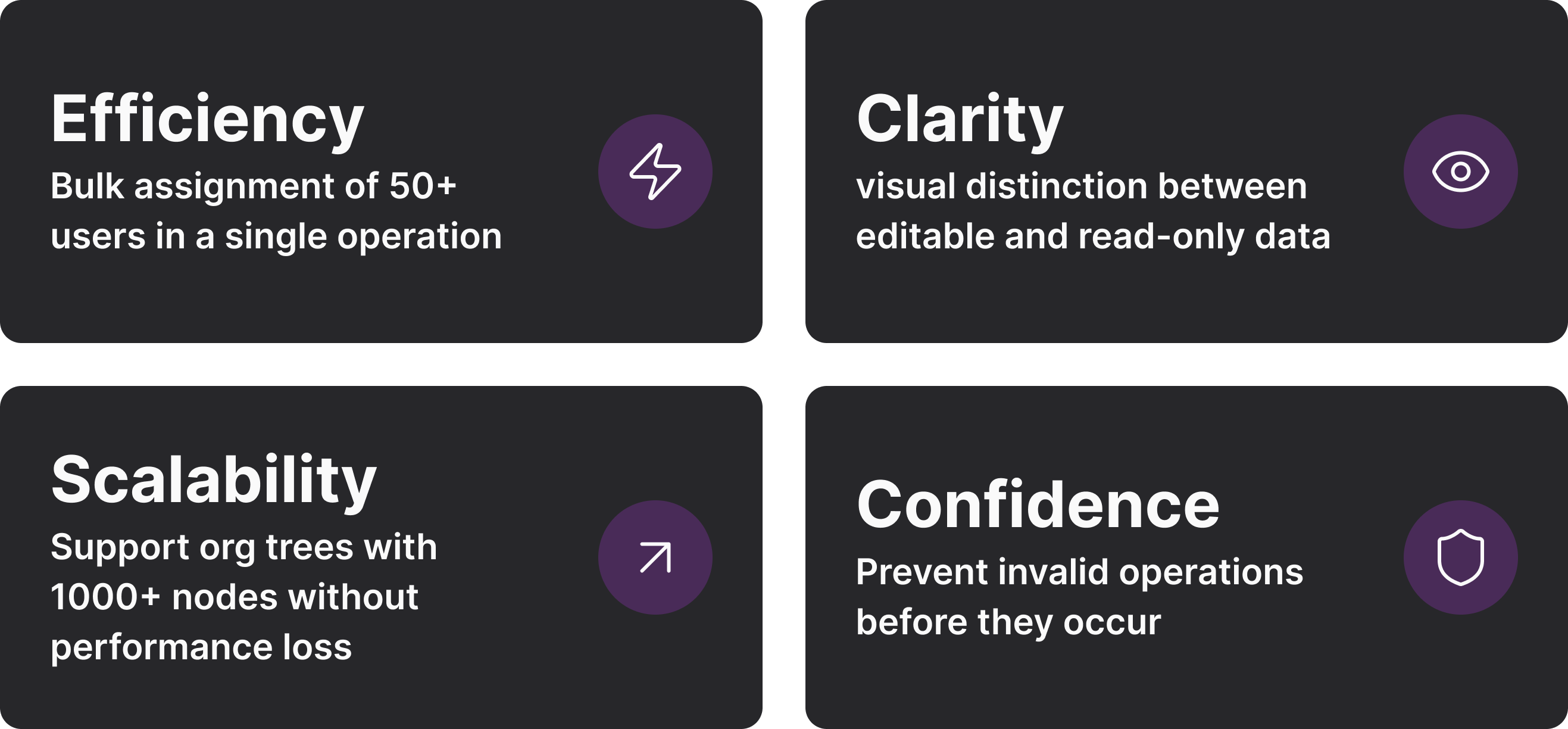
Both paths needed to feel native. I established four design goals to guide every decision:
Solution
Two-Tier Data Architecture
The breakthrough was establishing a clear visual and functional split between two types of organizational entities. This decision eliminated the root cause of most user confusion. Invalid actions are disabled with explanatory tooltips, so users always understand why they can't do something.
Bulk Operations with Smart Filtering
The primary pain point was manual, one-by-one assignment. I designed a multi-step bulk workflow:
- Filter: Narrow users by name, group, or org path
- Select: Multi-select with a live count badge
- Target: Tree picker showing only valid Training Groups (Task Orgs disabled)
- Confirm: Preview modal: first 5 users + "and 70 more…"
- Execute: Progress indicator with granular success/failure reporting
Users see exactly who they're selecting before committing, which dramatically reduces errors and builds confidence.
Reflection
This project fundamentally changed how I approach enterprise design. I learned that clarity is the ultimate feature in complex systems. Every decision - from color choices to interaction patterns - needed to answer one question: Does this help users understand what they're looking at and what they can do?
Most importantly, designing for different mental models proved essential. The dual navigation pattern (group → users vs. user → groups) emerged from recognizing that different roles approach the same data from different angles. Supporting both paths (rather than forcing one "correct" way) created a more flexible, humane system.
View the Prototype here.