Enterprise Resource Management Platform for Government Cyber Training Infrastructure
UX/UI Designer
Engineering, Backend Development, Product Management, QA, and operations stakeholders
Figma, Figma Make
View the Prototype here.
Summary
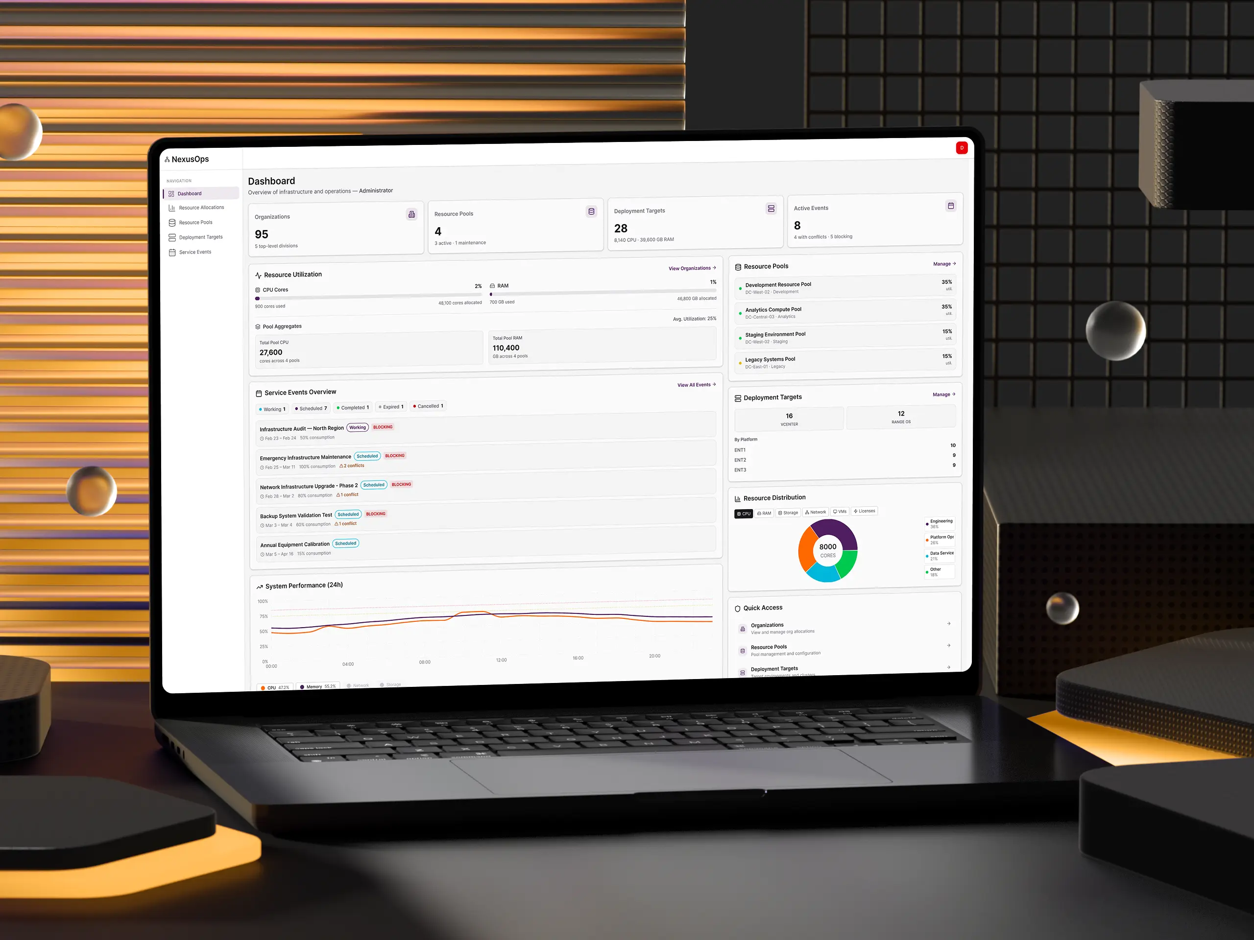
I contributed to the UX design for an enterprise resource management platform, working alongside leads, stakeholders, and frontend developers to transform a manual, spreadsheet-driven process into an intuitive system that enables transparent allocation of compute resources across complex government organizational hierarchies. The platform now serves as the single source of truth for resource allocation and scheduled maintenance event management across the infrastructure, handling scheduling for thousands of training events and enabling efficient coordination across multiple deployment engines.
Customer Insight Informing Our Work
Feedback from operators and administrators revealed critical pain points:
- Resources were being over-allocated, leading to deployment failures and training disruptions.
- There was no centralized view of resource availability across the organizational hierarchy, making capacity planning nearly impossible.
- Scheduled maintenance events were tracked manually, causing confusion about system availability and unnecessary user disruption when maintenance only affected specific components.
Team Opportunity
How might we create a transparent, hierarchical resource management system that prevents conflicts while maximizing resource utilization across government organizations?
The platform needed to move from decentralized, resource allocation to a centralized system that could enforce organizational quotas, prevent over-allocation, and provide real-time visibility into resource consumption across the entire infrastructure.
Problem Space
"I need to know what resources are available for my organization and when I can schedule training events without conflicts."
Administrators and mission planners struggled with:
- No visibility into available resources across their organizational hierarchy
- Deployment failures due to over-allocation and scheduling conflicts
- Manual coordination required for every training event and maintenance window
- Confusion about maintenance events and which systems would actually be affected
- No enforcement of organizational resource quotas
User Personas
To ground design decisions in real operational needs, the team developed three composite personas representing the key roles interacting with the platform:
The Operations Manager (Administrator)
Technical Proficiency: Moderate | Scope: Top-level command (200+ organizations)
This user oversees resource allocation across the entire organizational hierarchy. The previous workflow relied on manual spreadsheet tracking with no visibility into downstream effects of allocation changes. They need a dashboard-level view of system health, drill-down navigation into org hierarchies, and audit trails for compliance reporting.
Key goals: Ensure subordinate organizations have adequate resources for missions, schedule maintenance without disrupting training, monitor utilization across the hierarchy, and audit allocation changes for compliance.
The Resource Manager (Allocation Editor)
Technical Proficiency: High | Scope: Mid-level unit (nested 3 levels deep, 4 subordinate groups)
This user manages resource distribution across subordinate teams. They could only see their own unit's allocations (not parent constraints) leading to resource requests denied without explanation. Manual math was required to balance guaranteed vs. flexible allocations, and changes to parent allocations would silently break local planning.
Key goals: Request additional allocations for upcoming training cycles, distribute resources fairly across subordinate groups, and ensure no team is starved during high-demand periods.
The Scheduler (Event Editor)
Technical Proficiency: Low-Moderate | Scope: Operations division coordinating across 15+ organizations
This user schedules weekly maintenance windows across many organizations. The previous calendar system didn't show resource consumption levels, and conflicts were discovered only when deployments failed at runtime. There was no way to distinguish "hard stop" maintenance from "partial capacity" events.
Key goals: Schedule maintenance without accidentally blocking critical training exercises, coordinate with multiple organizations to avoid conflicts, and track upcoming scheduled events.
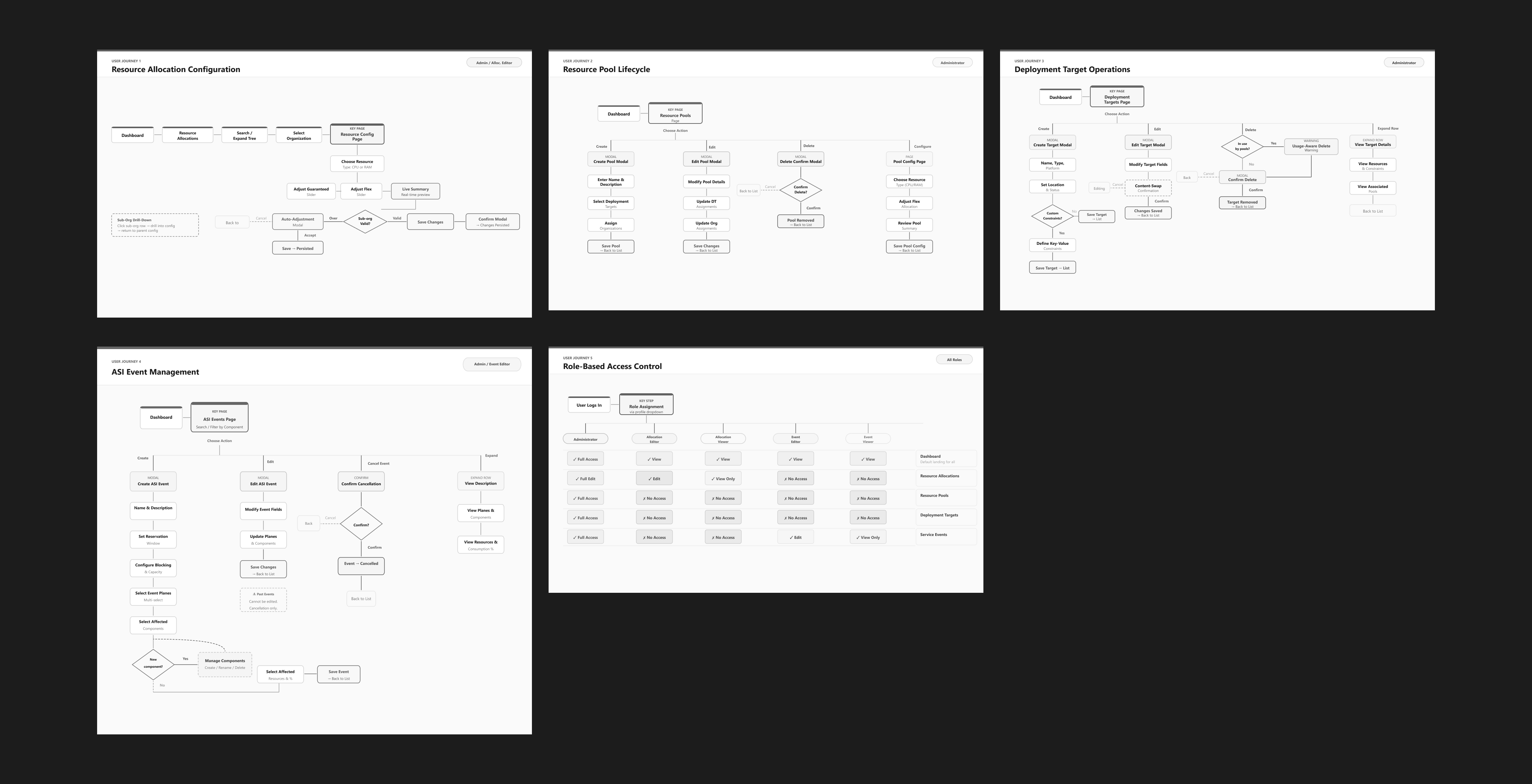
Key UX Interaction Patterns
Beyond the core interfaces, several critical interaction patterns emerged from stakeholder feedback and iterative design:
Proactive Conflict Detection Engine
Rather than surfacing scheduling conflicts after submission, the system detects overlaps in real time as users input dates, select infrastructure segments, and configure capacity impact. Conflicts display with severity levels (high / medium / low) using color-coded warnings. A key design decision: users can acknowledge intentional conflicts via checkbox - providing an escape hatch for coordinated dual-team maintenance scenarios.
Auto-Adjustment with Impact Preview
When a parent organization's allocation decreases (e.g., budget cuts), all subordinate organizations must decrease proportionally. Instead of requiring manual recalculation across dozens of orgs, the system automatically computes proportional reductions and presents an impact preview table showing current vs. proposed allocations with percentage changes for each affected org. Administrators can accept with one click or cancel to handle adjustments manually. A safety constraint prevents any org from dropping below its current "used" amount.
Type-to-Confirm Deletion Pattern
For critical destructive actions (cancelling events, deleting resource pools), the platform uses a type-to-confirm pattern. Users must type the exact resource name to enable the action button - forcing cognitive engagement and preventing accidental deletions that would affect dozens of organizations. This multi-layer friction approach (impact warning → type confirmation → button enable) is intentionally high-friction for high-stakes actions.
Affected Components Tagging & Filtering
A searchable multi-select combobox allows event creators to tag affected platform components from a predefined registry. This replaced a free-text comma-separated input that led to typos and inconsistent naming. A dedicated Manage Components modal decouples registry maintenance from event creation, and a Component filter on the events table lets operators quickly scope to a specific component's impact without manually expanding every row.
Reflection
How did I feel when working on this design challenge?
This project challenged me to think systematically about complex hierarchical data structures and translate abstract backend concepts into intuitive visual interfaces. Designing for government infrastructure meant balancing technical precision with operational efficiency. Every interaction needed to prevent costly mistakes while enabling rapid decision-making during time-sensitive operations.
What would I have done differently?
With more time, I would have conducted usability testing with actual operators to validate the tree navigation patterns and resource modification workflows. I also would have explored more sophisticated visualization options for capacity planning. Heat maps showing resource utilization over time could help administrators identify patterns and optimize allocations proactively. The notification system for maintenance events deserves deeper exploration; relying on users to check the tool isn't sufficient for emergency scenarios.
View the Prototype here.