Building a Cross-Framework Design System
UX/UI Designer & Design System Architect
Front-end developers, QA
Figma, Token Studio, Style Dictionary, Storybook, Playwright, Vitest
Context
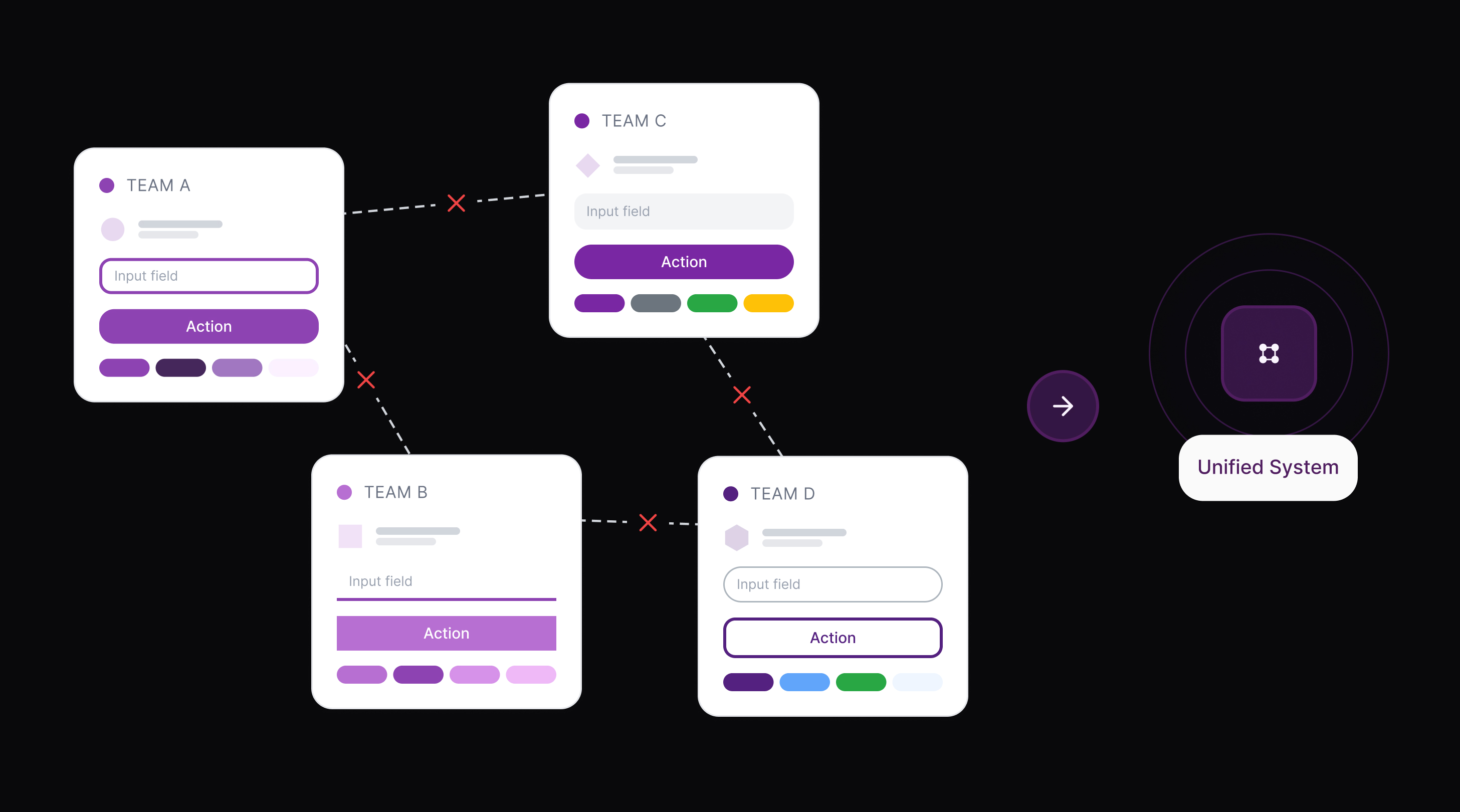
When I joined CESI as the sole designer supporting multiple product teams, I inherited a familiar situation: every application had its own UI. Buttons looked different across products. Form patterns were inconsistent. Accessibility was hit-or-miss depending on who built the page. And with teams split across React and Angular, the same component was being built twice but differently each time.The core problem was a lack of shared infrastructure. There was no single source of truth connecting what was designed in Figma to what was shipped in code. Every handoff was a translation exercise, and every translation introduced drift.As the only designer spanning all teams, I was in a unique position to see the full picture and to do something about it.
Discovery
The audit that made the case
I started by documenting the inconsistencies across CESI's product suite. What I found:
Multiple button styles, badge variants, and form patterns with no shared source of truth
Accessibility gaps: No consistent WCAG compliance across products
Manual token translation from Figma causing errors and drift
React and Angular teams solving the same problems independently, arriving at different results
This wasn't just a visual consistency problem. It was costing the team time on every project and creating confusion for users navigating between CESI applications.
Research
Learning from the best - then scoping for our reality
I studied public design systems from Shopify (Polaris), Google (Material), Adobe (Spectrum), IBM (Carbon), and the U.S. Web Design System. These were extremely useful, but too large to replicate with a small team.
What shaped my approach:
Atomic Design principles for organizing components into scalable, nested layers
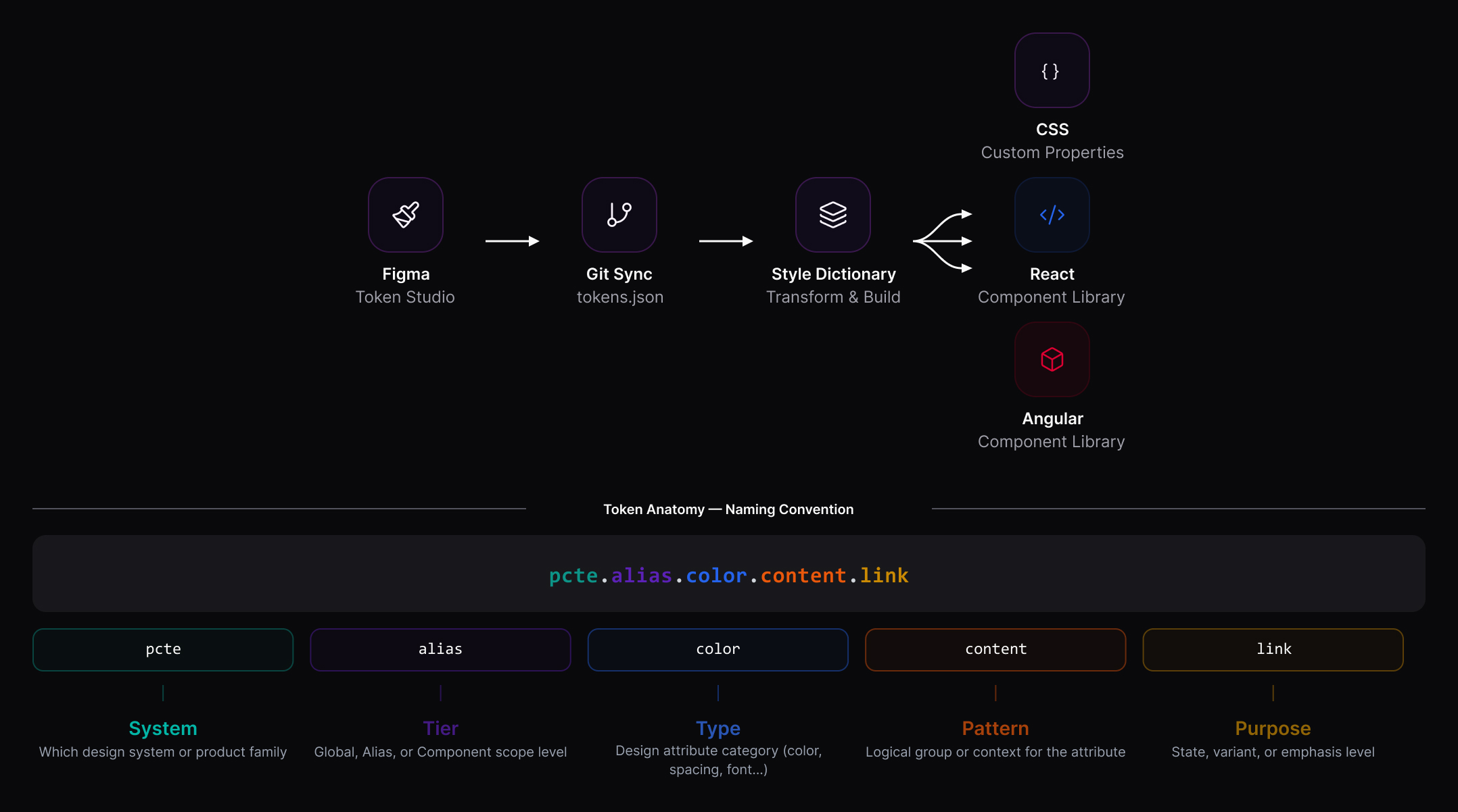
Token-driven theming so visual decisions could flow from Figma to code automatically
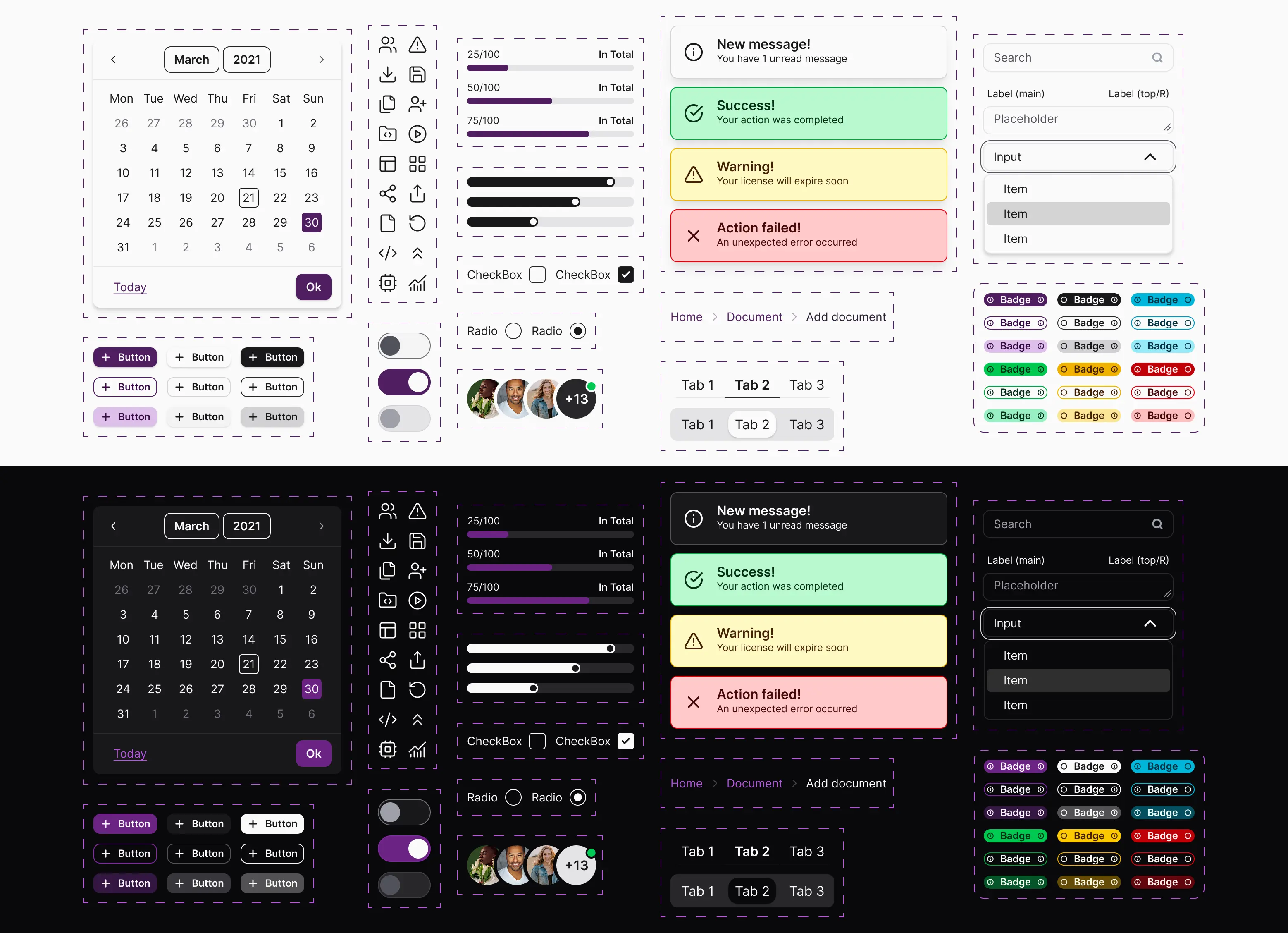
I also evaluated design system management tools (Storybook, Zeroheight, Supernova, Token Studio) and recommended Storybook as the central hub for component development and documentation, paired with Token Studio feeding Style Dictionary for the Figma-to-code pipeline.
Define
Who is this for?
Before building anything, I mapped out who the design system needed to serve - both as end users and contributors.
End users:
Developers: Reuse components, customize within standards, follow usage guides
Designers: Model screens quickly with consistent, token-driven components
QA: Validate against repeatable accessibility and visual standards
Project managers: Plan work with shared UI expectations
Contributors:
Design system developers: Build and maintain the library, fix bugs
Design system designers: Design foundations and components, iterate through audits
Design system QA: Create test cases, validate regressions
What does "done" look like?
I co-authored a Definition of Done with QA and development so every component shipped with the same quality bar:
Design completeness
All variants and states accounted for
Developer annotations included
Behavior described as pass/fail rules
Tested
Tokens validated across themes in Figma
WCAG 2.1 AA compliance verified
Visual regression passed in Storybook
Cross-browser checks completed (Chrome, Firefox, Edge)
Documented and released
Usage guidelines published
Storybook props documented
Code merged, versioned, and released via NPM
Build
Token + foundation architecture
I designed a three-tier token system (global → alias → component) covering color, typography, spacing, borders, states, and breakpoints. The pipeline worked like this:
Design tokens are updated in Token Studio
Tokens export as JSON following the Design Tokens Spec
Style Dictionary transforms tokens into CSS variables for both frameworks
Developers consume tokens
Cross-framework component library
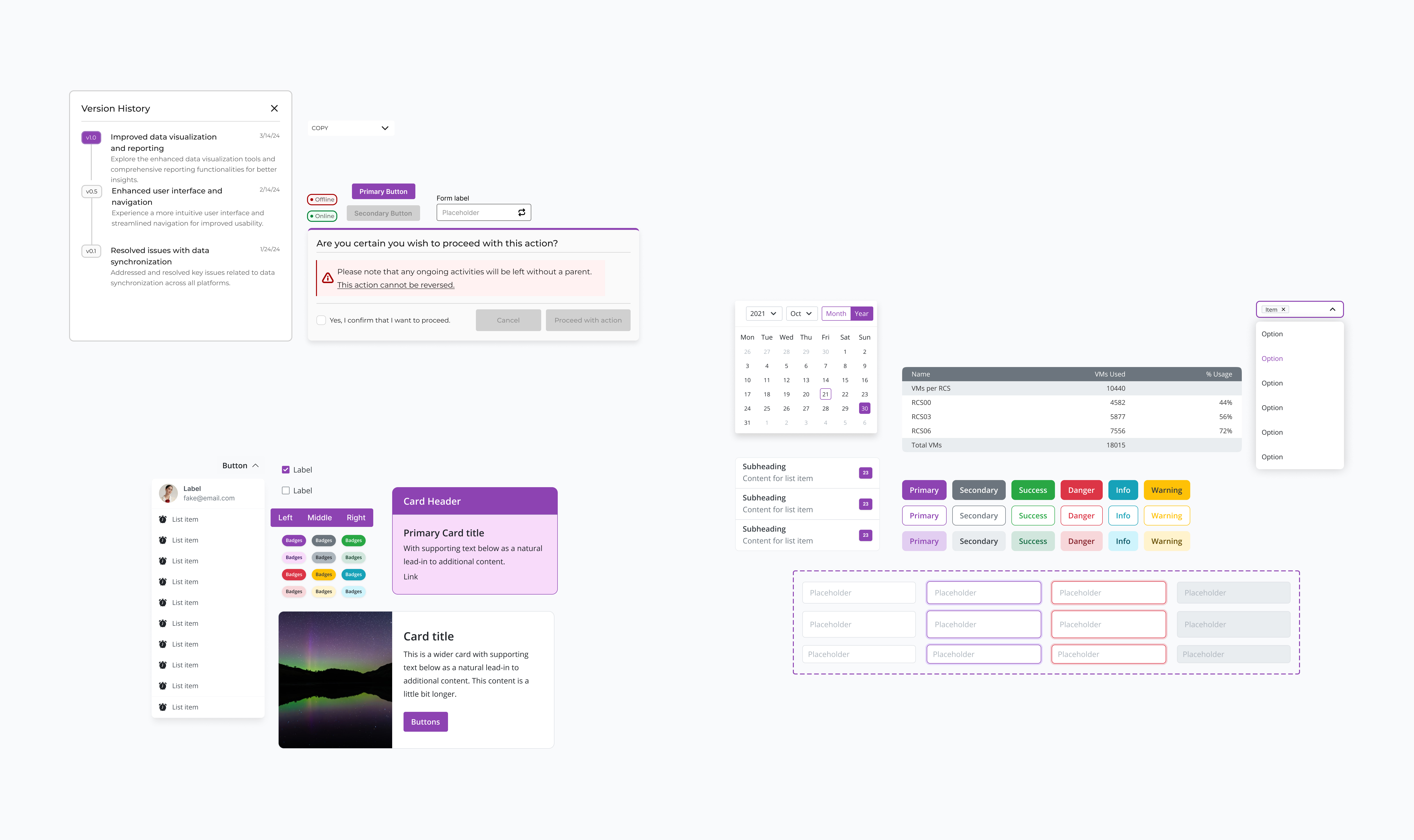
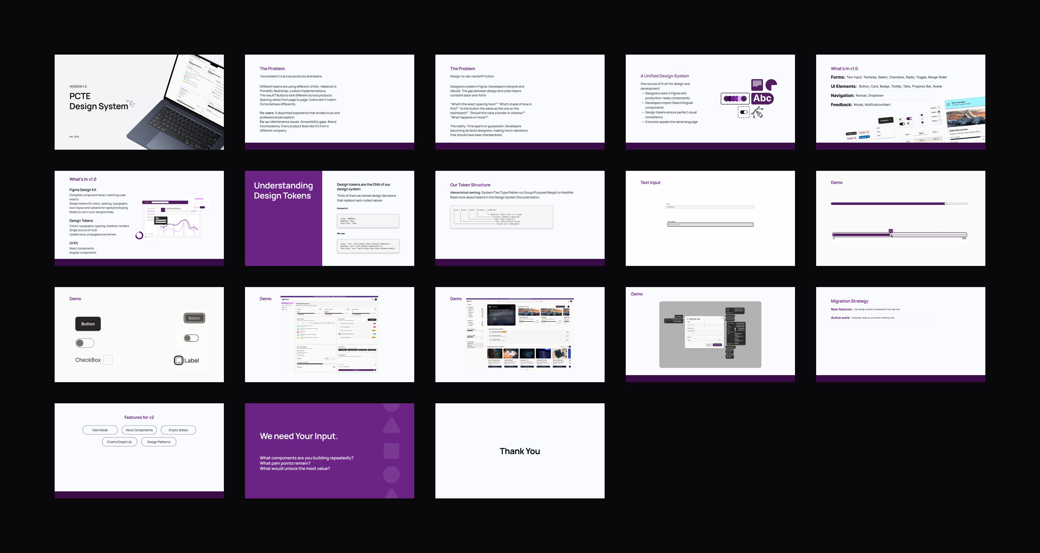
Components were built in both React and Angular with identical visual and functional behavior. The library included badges, buttons, cards, modals, notifications, form elements (inputs, selects, toggles, range sliders), tabs, and navigation patterns.
Each component went through the following workflow:
Specification: A detailed behavior and interaction spec covering expected states, interaction logic, edge cases, and accessibility requirements. These specs were structured as pass/fail rules so QA could verify them directly.
Examples of what specs covered:
Table: sorting logic, row selection persistence across pagination, empty/loading states, sticky headers, horizontal scroll behavior
Date/Time Picker: calendar navigation, time input validation, flexible format parsing (e.g. "2/5/26" → "02/05/2026"), AM/PM toggling, popover positioning
Sidebar: persistent vs. collapsible modes, nested navigation with expand/collapse, icon-only collapsed state with tooltips, responsive drawer with focus trapping, and full keyboard + screen reader support
Design: I created the component in Figma with all variants, states, and developer annotations.
Design review: Walked through the Figma component with developers to align on expected behavior, flag complexity, and surface any technical constraints early.
Kick-off: A focused session covering accessibility requirements, dependencies, and any open questions from the spec or design review.
Development: Developers built the component in both React and Angular, referencing the spec and Figma annotations. I stayed available for clarification and reviewed in-progress builds.
Design amendments: Adjustments based on what surfaced during development (edge cases, token gaps, or interaction refinements.)
Documentation: We documented usage guidelines, avialable props in Storybook, and created code samples for both frameworks.
Documentation review: Reviewed with developers and QA to confirm accuracy, completeness, and alignment with the spec.
Testing: Ran the testing suite: accessibility, cross-browser, visual regression, and design fidelity against Figma.
Bug fixes: Any issues from testing were prioritized by severity and resolved before release.
PR approval and sign-off: Final code review, merge, versioning, and NPM publish.
Collaborate
How I worked with developers
Building a design system in isolation guarantees no one will use it. I embedded collaboration into the process from the start:
Pre-release working sessions: I facilitated meetings to define the rollout approach, migration strategy, and support model. We landed on a lunch-and-learn format targeting team leads and frontend devs.
Weekly syncs: Recurring sessions to align on framework and tooling decisions, track component progress, and resolve blockers.
Impact
What the team experienced
Faster builds: Developers stopped recreating common components. Reuse replaced rebuilding, and new features shipped with less setup time.
Cleaner handoffs: Specs and Figma annotations gave developers everything they needed up front. The back-and-forth that used to slow down every component dropped significantly.
Higher QA confidence: With a shared Definition of Done and testable behavior specs, QA could validate components against clear criteria instead of subjective review.
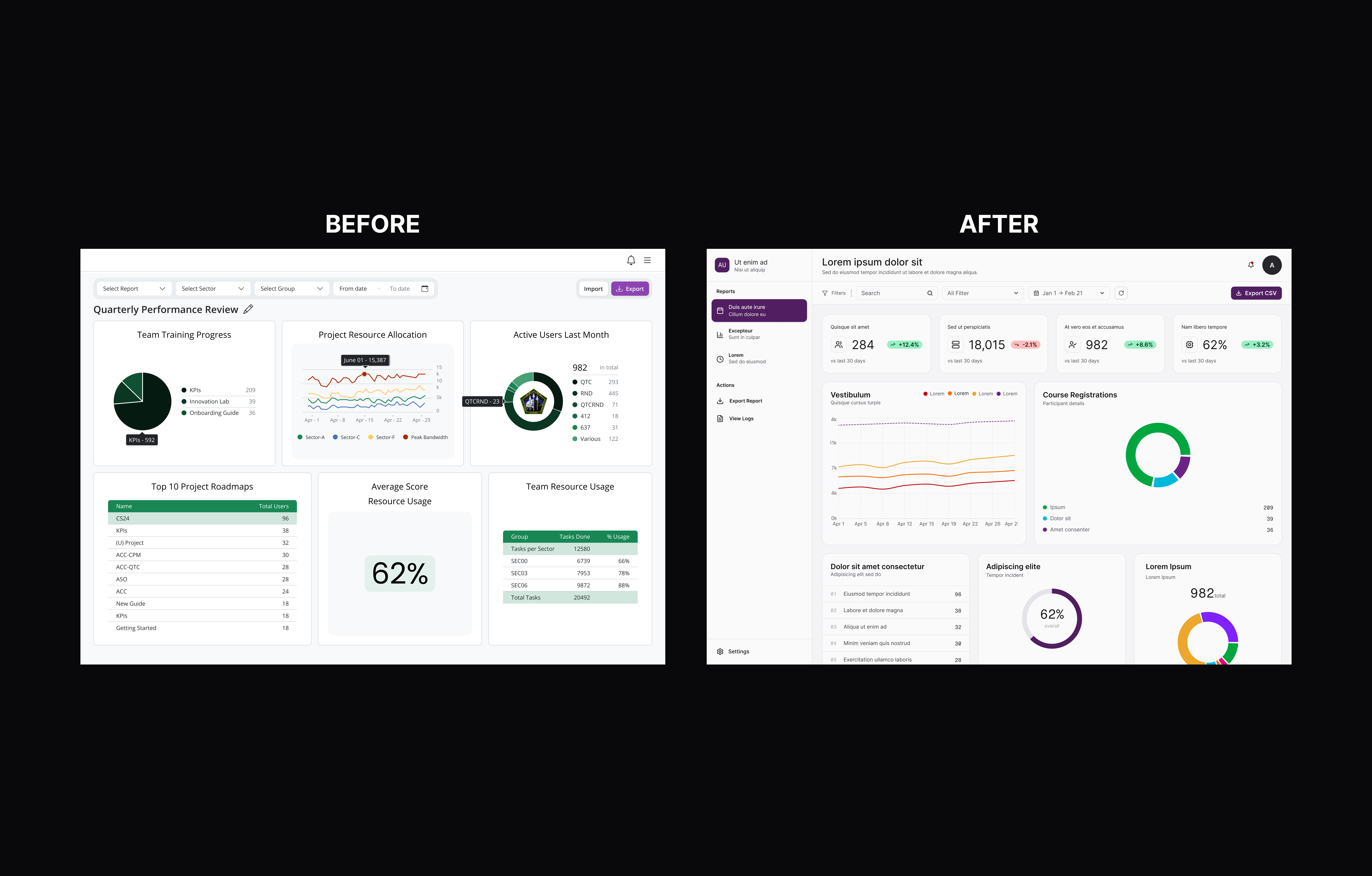
Visual consistency across products: Applications built by different teams in different frameworks started looking and behaving the same way.
Government recognition: Stakeholders noticed the improvement. The updated UI quality across CESI products was explicitly praised.
What was hard
Not everything went smoothly:
Bandwidth: As the sole designer across all teams, I was constantly balancing design system work against active product work.
Unclear starting point: Government stakeholders didn't provide strong initial direction on styling or process, which meant early decisions were made with limited guidance and had to be revisited.
Token architecture gaps: The first token structure didn't account for all component use cases. It took iteration (and real bugs) to get the three-tier model right.
Reflection
This project taught me that a design system is never just a component library - it's a culture change. The hardest part wasn't building the components. It was getting multiple teams, working in different frameworks on different products, to trust and adopt a shared system. What made it work was embedding collaboration from the start: running lunch-and-learns instead of just publishing docs, writing specs detailed enough that developers could build without guessing, and creating a Definition of Done that gave everyone a shared quality bar. This project also pushed me technically. Managing a token pipeline across two frameworks, debugging cross-browser rendering issues, and thinking about NPM versioning strategies aren't typical design tasks - but they were necessary to make the system real.